What is Responsive Web Design?
Responsive web design is simply designing websites to be responsive. That is, websites that respond to the users screen size.
Different devices have different screen sizes and having one set website for every screen can cause problems. You may have seen it before. Visiting a website on your mobile and the website is very zoomed out and difficult to read? That’s because the website isn’t responsive, it’s simply showing you a desktop website on a mobile screen.
Examples of responsive web design
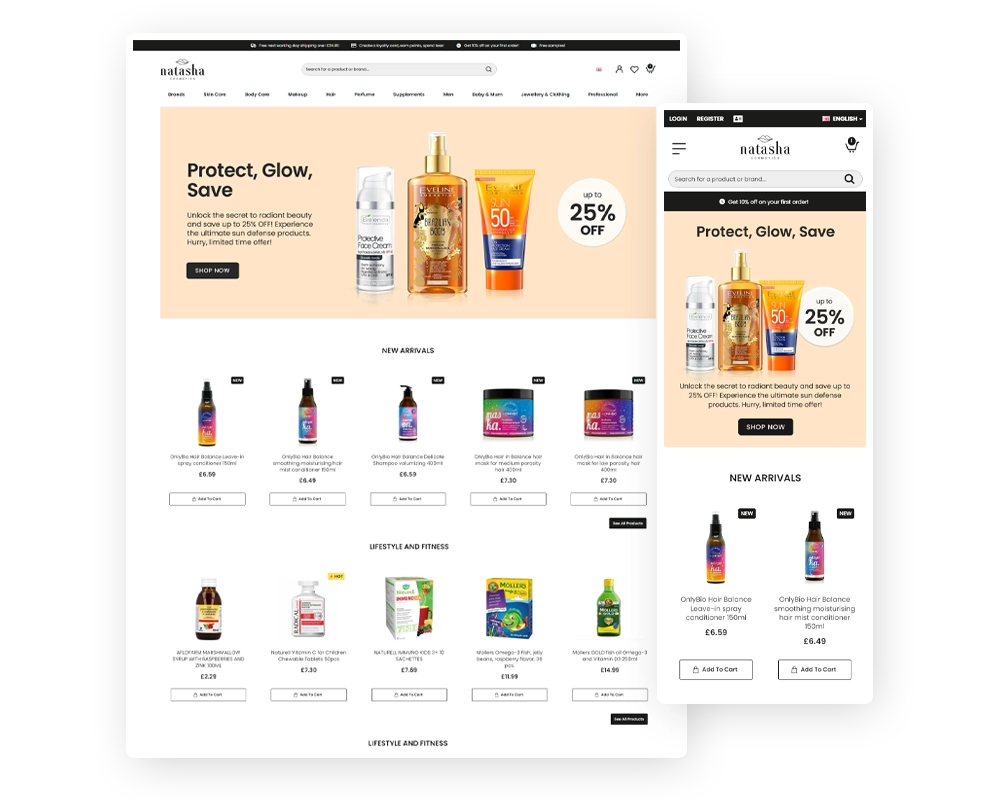
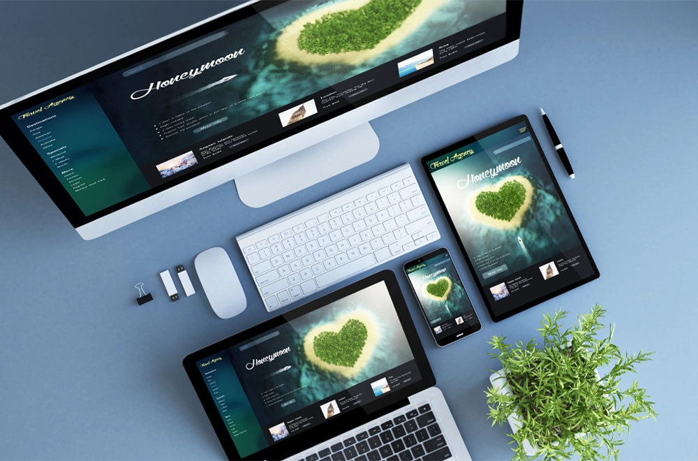
As you can see, the same web page looks different on different devices. They still all look like the same web page but the display is different to ensure it looks good across different devices. As you can see on the example picture below, we’re even able to display images differently. This lets us give a website a completely different feel on desktop vs mobile but still give all the key information to clients.

How do we resolve the responsive issue?
Responsive web design addresses the need for websites to require different appearances for different screens, allowing them to look and function correctly across all appropriate devices, such as phones, tablets, laptops, and computers. This requires adapting the website’s layout and design to scale properly within certain bounds, resulting in distinct appearances and functions on different screens.
As well as looks, functionality can change depending on devices, tap vs click are quite similar but can act differently. It’s important when building a website to also ensure it works well using different input methods like touch, keyboard and mouse, or any other input method.
A quick test
Just for a simple example, we’ve created a small text box below. That text box will say “Desktop”, “Tablet”, or “Mobile” depending on what screen size you’re using. This is a much more general example as there are only three different options to choose from, when a website is created it has to work across every different screen size inside those options.
It looks like you’re on Desktop
I think you’re on a Tablet
It looks like you’re on Mobile
This simple example doesn’t work for everything, for example it calls a “Nest Hub Pro” a desktop whereas the regular “Nest Hub” it considers a tablet. This is a simple implementation of responsiveness. There are three containers but they’re hidden unless your screen is a certain size. It’s also possible to show the container to all sizes at once or a choice of sizes.
How does Responsive Web Design affect your business?
Customers expect the website to work no matter what device they’re using it on.
Depending on your business, you may get more clients on desktop or mobile. Sometimes almost entirely one or the other, but it is still best practise to have a responsive website to maximise views.
Having the website be responsive helps with futureproofing, the website works at any screen ratio, meaning the website will work on any device using a screen. This is more important than ever as we’re seeing new technologies being released. Apple’s latest release (As this is being typed in 2023), Apple Vision AR Headset, has shown people browsing the web using Augmented reality. All of our websites will function well on an Apple Vision AR Headset as they are responsive.
How we deal with Responsive Web Design
Every single one of our websites is designed using a responsive framework. We also test each website extensively across a range of actual screen ratios commonly used and even some that don’t. That way we know we’re prepared for whatever devices may be made in the future.
If you would like your own responsive website then talk to our team! We’d be happy to discuss your website needs.
Let’s Make Things Happen
Reach out to our team today and let us bring your vision to life with a truly remarkable website tailored to your needs!


